To hide element when printing, add a print-specific CSS rule that removes the selected element from the printed layout while keeping it visible on screen. This is useful for navigation menus, buttons, advertisements, comment forms, and other controls that help on a website but do not belong on paper or in a print-to-PDF result.
The most common solution is display: none inside an @media print block. A print stylesheet can do much more than hide one division: it can simplify navigation, improve contrast, control page breaks, remove decorative elements, and preserve the information a reader actually needs.
This guide starts with the small technique from the original example and develops it into a maintainable print layout. It also explains the difference between hiding, removing space, and making content transparent, followed by testing and accessibility advice.
1. How Print Stylesheets Work
1.1 Screen and print are different outputs
A web page is usually designed for interaction on a screen, while a printed page is a fixed output with limited space. A navigation bar, hover control, cookie notice, or share button may be useful online but distracting when a reader prints an article.
1.2 The print media type
CSS media queries let you apply rules based on the output medium. The print media type matches printing and print preview, including many browser flows that produce a PDF. The screen styles remain available for normal browsing.
1.3 Start with a class
Use a descriptive class for elements that should disappear in print. A class is easier to reuse and clearer than targeting an arbitrary element selector:
.hide-on-print { display: none; }
That rule should normally be inside a print condition so it does not hide the element during ordinary screen viewing.
2. Hide an Element with CSS
2.1 Use display: none
The direct pattern is:
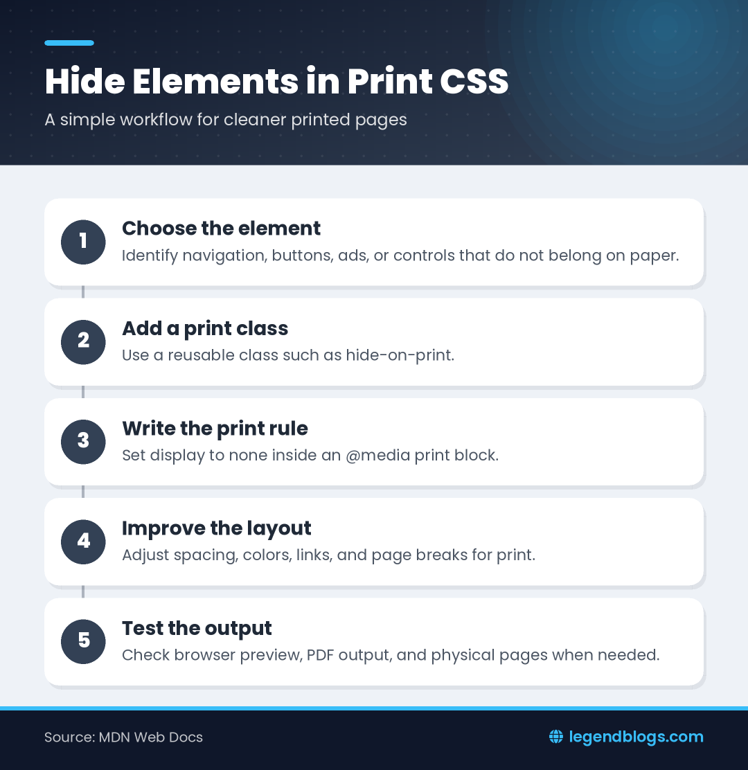
@media print {
.hide-on-print {
display: none !important;
}
}
Add the class to the element that is not useful on paper:
<button class="hide-on-print">Save changes</button>
The button remains visible on the screen but is removed from the printed layout. Use !important only when an existing rule has enough specificity to override your print rule; a normal selector is preferable when it works.
2.2 Hide by identifier when appropriate
An ID selector can work for one unique element:
@media print { #site-navigation { display: none; } }
A reusable class is usually more maintainable when several controls should be hidden. Keep the selector close to the component's print behavior and document exceptions.
2.3 Hide a group through a wrapper
When a group of buttons or an entire sidebar should disappear, apply the class to its wrapper. This avoids repeating the same rule on every child and removes the empty container along with its contents.
3. Use the @media print Rule
3.1 Put print rules in the main stylesheet
A small site can keep print rules next to the regular styles:
body { font-family: sans-serif; }
@media print {
nav, .share-controls, .ad, .hide-on-print { display: none; }
body { color: #000; background: #fff; }
}
This keeps the complete design in one place and makes the relationship between screen and print behavior easy to find.
3.2 Use print-only styles
Some content can be useful only on paper, such as a document reference, a footer URL, or a short “printed from” line. Hide it on screen and reveal it in print:
.print-only { display: none; }
@media print { .print-only { display: block; } }
Do not add duplicate information merely to increase printed length. Print-only content should improve identification or usability.
3.3 Control specificity
If the element remains visible, inspect the browser's computed styles. A more specific selector, inline style, or later stylesheet may override the print rule. Prefer a clear component selector and place the print rules where the cascade can be understood.
4. Use a Separate Print Stylesheet
4.1 Link a print-only file
A larger website can keep print rules in a dedicated file:
<link rel="stylesheet" href="print.css" media="print">
Inside print.css, place rules such as:
.site-header, .site-footer, .sidebar, .hide-on-print { display: none; }
This approach separates interactive design from the document output and gives the print stylesheet a clear ownership boundary.
4.2 Organize the file by purpose
Group rules for visibility, typography, layout, tables, images, and page breaks. A predictable structure helps future maintainers change the printed document without breaking the screen version.
4.3 Remember that loading and applying differ
A browser may download a linked stylesheet even when its media condition does not currently match, but the rules do not apply until the condition matches. Always test the resulting output rather than assuming that a network request means the styles are active.
5. Hide Common Web Elements
5.1 Navigation and interactive controls
Hide menus, breadcrumbs that do not help identify the document, search fields, share controls, login buttons, and interactive form controls when the printed version does not need them. Keep a document title and useful context visible.
5.2 Advertisements and decorative content
Ads, animated banners, decorative backgrounds, and large promotional panels often waste paper. Remove them when they do not carry essential information, but do not hide a warning or notice that the reader needs to understand the document.
5.3 Forms and action buttons
A “Submit” button has no purpose on a paper copy, but its associated labels and entered values may matter. Hide only the control, not the user-provided content that documents the completed form.
6. Compare display, visibility, and opacity
6.1 display: none removes layout space
With display: none, the element is not rendered and its layout space is removed. This is usually the correct choice when a print-only document should close the gap left by a screen control.
6.2 visibility: hidden keeps the space
Visibility hidden makes an element invisible but can preserve its layout space. That may leave a blank area in the printed page, so it is normally less suitable for removing a button or sidebar.
6.3 opacity does not mean removed
Opacity: 0 makes content transparent, but the element can still occupy space and may interact with layout or printing behavior. Do not use opacity as a substitute for print removal when the content should not exist in the output.
7. Control Printed Layout and Page Breaks
7.1 Keep headings with their content
A heading at the bottom of a page with its paragraph on the next page is hard to read. Use page-break and break properties supported by the browsers and printers you target, and test the actual output.
7.2 Avoid splitting important blocks
Tables, cards, quotations, and code examples may be difficult to read when split across pages. Request that a block avoid breaking when practical, but understand that a printer may still need to split content that is taller than one page.
7.3 Add sensible page breaks
For long reports, a class can request a new page before a major section. Use this sparingly because excessive forced breaks create blank areas and unnecessary pages.
8. Improve Colors and Backgrounds for Print
8.1 Use strong contrast
Printed pages often work best with dark text on a light background. Remove large colored panels and decorative shadows when they reduce readability or consume ink.
8.2 Do not depend only on background color
Browsers and users may disable background graphics in print settings. Essential labels, status indicators, and distinctions should remain understandable through text, borders, symbols, or structure.
8.3 Make links useful on paper
A printed link cannot be clicked. For important external references, consider displaying the destination in a print-only form, but avoid printing long tracking URLs or exposing private query parameters.
9. Test Print CSS Correctly
9.1 Use print preview
Open the browser's print preview and confirm that the element disappears, the surrounding layout closes up, and the remaining content is readable. Print preview is more useful than judging the screen alone.
9.2 Test PDF and physical output
Different browsers, PDF drivers, operating systems, and printers can produce different pagination and color results. Check at least one PDF output and, when the document is important, a physical print.
9.3 Test responsive states
Check the print result after viewing the page at different widths and after expanding menus or accordions. Hidden interactive content should not leave inaccessible or unexplained gaps in the printed document.
10. Accessibility and Content Considerations
10.1 Do not hide essential information
Before removing an element, ask whether it communicates a warning, instruction, label, or required value. A print stylesheet should remove interface noise, not information that a reader needs.
10.2 Keep document structure meaningful
Use headings, lists, labels, and table headers correctly. Print CSS changes appearance, but it does not repair an unclear document structure or replace accessible HTML.
10.3 Provide an alternative when needed
If an interactive control performs an important action, include a suitable printed instruction or status message. A button that is intentionally hidden should not be the only place where a necessary instruction exists.
11. Common Print CSS Mistakes
11.1 Putting the media attribute in the wrong place
The media condition belongs on a style or link element, or in an @media rule. Check the HTML structure and ensure the CSS is valid.
11.2 Using an incorrect class name
Class names are case-sensitive in some selector contexts and must match the HTML exactly. Inspect the element and verify the computed print rule.
11.3 Expecting screen screenshots to prove print behavior
A screen screenshot does not test the print medium. Use preview or a print emulation tool, then verify the output as a document.
11.4 Hiding the parent but keeping unwanted content elsewhere
Check whether a duplicated element, pseudo-element, or print-only copy still appears. Search the DOM and computed styles when the output contains something you expected to remove.
FAQ
How do I hide a div when printing?
Give the div a class and set that class to display: none inside an @media print rule. The div remains visible during normal screen browsing.
Does display: none work in print CSS?
Yes. It removes the selected element from the printed layout when the print rule is applied. Test the result in print preview because other CSS can override it.
What is a CSS print media query?
A print media query is an @media print block or a stylesheet linked with media="print". It applies rules to printing and many print-to-PDF flows.
How do I hide buttons from a printed page?
Add a reusable class to the buttons and set that class to display: none in the print stylesheet. Keep any important labels or entered values visible if the printed document needs them.
Can I create a separate stylesheet for printing?
Yes. Link a file with media="print" or maintain an @media print section in the main stylesheet. A separate file is convenient when the printed layout has many rules.
Conclusion
To hide element when printing, use a clear class and a print-specific display rule. The same print stylesheet can remove navigation and controls, improve contrast, manage page breaks, and make the final document easier to read.
Start with the smallest rule, then inspect the complete printed output. Test preview, PDF, and physical printing when the document matters, and never remove information that readers need simply because it is inconvenient on screen.





Write a comment