
Hi, Sometimes we need to show a piece of information to the user as a popup, but I can't use the Bootstrap modal for that. So that time we need to create a bootstrap Snackbar, or we can say that a Toast. Snackbar is often used as tooltips/popups to show a message at the bottom of the screen.
Generally, Toast is a popup for showing a piece of small information to the user, this is also using in the android application. We can customize our Toast layout according to our requirements. It will be shown on the screen when you call it and It will disappear after a few seconds, whatever you have set.
Now, we are going to show you a cool Snackbar / Toast example for showing the Google Play Store and YouTube buttons on the bottom side of the screen as a popup with the close button.
Create your HTML code for the Snackbar with id #snackbar, you can use Bootstrap classes for the responsive design just like that:
<div class="container">
    <h2 class="text-danger">Cool Snackbar/Toast demo</h2>
    <div id="snackbar">
        <div class="close"><i class="fas fa-times-circle"></i></div>
        <div class="col-sm-6 col-xs-6 col-md-6">
            <a hreflang="en-in" href="https://play.google.com/" target="_blank" >
                <img src="google-play-store.png" alt="Google Play Store">
            </a>
        </div>
        <div class="col-sm-6 col-xs-6 col-md-6 second">
            <a hreflang="en-in" href="http://youtube.com/" target="_blank" >
                <img src="youtube.png" alt="YouTube Link" >
            </a>
        </div>
        <div class="clearfix"></div>
    </div>
</div>
Now, we will create a style for #snackbar with the show and hide class, use the @WebKit-keyframes method for fade-in and fade-out.
#snackbar {
    visibility: hidden;
    background-color: #FFFFFF;
    text-align: center;
    border-radius: 5px;
    padding: 16px;
    position: fixed;
    z-index: 1;
    bottom: 30px;
    width:80%;
    bottom: 30px;
    box-shadow: 0px 0px 30px 20px grey;
}
#snackbar .close {
	float:right;
	color:#FF0000;
	z-index: 1;
	opacity: 0.6;
	margin-top: -23px;
    margin-right: -23px;
}
#snackbar .second {
	border-left: 1px solid #FF0000
}
#snackbar img {
	width:200px;
}
#snackbar.show {
    visibility: visible;
    -webkit-animation: fadein 0.5s;
    animation: fadein 0.5s;
}
#snackbar.hide {
    -webkit-animation: fadeout 0.5s 2.5s;
    animation: fadeout 0.5s 2.5s;
}
@-webkit-keyframes fadein {
    from {bottom: 0; opacity: 0;}
    to {bottom: 30px; opacity: 1;}
}
@keyframes fadein {
    from {bottom: 0; opacity: 0;}
    to {bottom: 30px; opacity: 1;}
}
@-webkit-keyframes fadeout {
    from {bottom: 30px; opacity: 1;}
    to {bottom: 0; opacity: 0;}
}
@keyframes fadeout {
    from {bottom: 30px; opacity: 1;}
    to {bottom: 0; opacity: 0;}
}
After all, create your JavaScript code for #Snackbar to show and hide effect.
    var x = document.getElementById("snackbar");
    setTimeout(function () {
        x.className = "show";
    }, 3000);
    setTimeout(function () {
        x.className = x.className.replace("show", "hide");
    }, 15000);
    $("#snackbar .close").click(function () {
        x.className = x.className.replace("show", "hide");
    });
This JavaScript code will show the Snakbar after 3 seconds page load automatically. And It will disappear after 15 seconds automatically.
What Is a Bootstrap Snackbar?
Snackbar and toast terminology
A snackbar is a temporary notification that appears over the page, often near the bottom of the viewport. It informs the user about a result, a background action, or an available choice without blocking the entire interface with a modal dialog.
The terms snackbar and toast are often used interchangeably. A toast usually disappears automatically, while a snackbar may include an action or close control. The visual pattern can be built with Bootstrap layout classes, custom CSS, and plain JavaScript.
When to use a temporary message
Use a snackbar for short feedback such as “saved,” “copied,” or “connection restored.” Do not use it for a message that requires a long explanation, a legal decision, or an important destructive confirmation. Those situations need a visible page section, modal, or confirmation flow.
Improving the HTML Structure
Use a clear container
The notification needs one predictable container with a stable ID or class. Put the message, optional action, and close button inside that container. Bootstrap’s container and grid utilities can help with responsive spacing, but the snackbar should remain easy to find in the document.
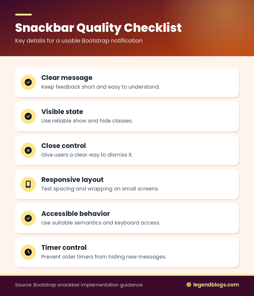
Use a button for a close control rather than a clickable generic div. Give the button an accessible label so screen-reader users know what it does. If the message is only informative, an appropriate live-region role can allow assistive technology to announce it.
Keep content concise
A snackbar should be readable at a glance. Use one short sentence and, when necessary, one action such as Undo or View. Long paragraphs wrap poorly on narrow screens and make automatic dismissal frustrating.
Creating Responsive Snackbar CSS
Positioning the notification
Use fixed positioning when the message should remain visible while the user scrolls. Set a suitable distance from the bottom and side edges, give the container a high stacking order, and limit its width so it does not cover the whole page on large screens.
On small screens, use a width based on the viewport with a maximum width for larger displays. Add horizontal margins so the notification does not touch the device edge. If the page has a mobile navigation bar, test whether the snackbar overlaps it.
Show and hide states
Keep the hidden state separate from the visible state. A class such as show can change visibility and opacity, while a transition or keyframe animation can move the element slightly upward. Avoid relying only on opacity because an invisible element may still receive focus or block interaction.
For a modern implementation, use a class toggle and let CSS handle presentation. JavaScript should decide when to show or hide the component, not repeatedly rewrite inline styles.
Showing and Hiding the Snackbar with JavaScript
Use classList instead of replacing class strings
The classList API makes the behavior easier to maintain. Add the show class when the message should appear and remove it when the message should disappear. This avoids accidentally removing Bootstrap classes or unrelated state classes from the element.
Keep a reference to the timer returned by setTimeout. When the user closes the snackbar manually or a new message replaces the old one, clear the previous timer before creating another. Otherwise, an old timer can hide a newer message too soon.
Automatic dismissal
Automatic dismissal should give users enough time to read the message. The exact delay depends on the length of the text and the importance of the notification. A short status message can disappear after a few seconds, while a message with an action should stay visible longer or remain until the user dismisses it.
Building a Reusable Notification Function
Pass a message as an argument
Instead of writing a separate click handler for every notification, create one function that receives a message and optionally a type. The function updates the message element, applies a success or error class, shows the container, and schedules dismissal.
This approach also makes the component useful after form submissions, AJAX responses, copy actions, and validation checks. Keep the function focused on the notification rather than coupling it to one particular button.
Supporting success, warning, and error types
Different message types can use distinct colors, icons, or borders. The color should not be the only way users identify the state; include meaningful text and, where appropriate, an icon with an accessible label.
Remove the previous type class before adding the new one. Otherwise a notification may retain an old background color when the next message is displayed.
Adding a Manual Close Button
Listen for the click event
Attach a click listener to the close button after the document has loaded or use event delegation if the button is created dynamically. The handler should remove the visible class and clear the active dismissal timer.
Do not make the close button depend on jQuery unless the rest of the project already uses it. Modern browsers provide the DOM APIs needed for class changes, event listeners, and timers.
Preventing stale timers
A timer created for the first message must not hide the second message. Store the timer in a variable shared by the show and hide functions. Clear it before displaying a new message and set it to null after dismissal.
Responsive Bootstrap Snackbar Design
Desktop layout
On a wide screen, a snackbar can use a compact maximum width and sit near the bottom center or bottom corner. Keep enough contrast between the message and the background, and ensure that the stacking order places it above cards, navigation elements, and other positioned components.
Mobile layout
On a phone, use a nearly full-width layout with safe side spacing. Keep action buttons large enough to tap and allow the text to wrap naturally. Test long translations because a message that fits in English may require several lines in another language.
Accessibility and Usability Tips
Use suitable semantics
A status message can use a status or polite live-region pattern, while an urgent error may require a stronger announcement. Do not interrupt the user unnecessarily. Provide a visible close button and make sure keyboard users can reach it.
Check color contrast and do not rely on red, green, or another color alone to communicate meaning. The text should explain what happened and what the user can do next.
Avoid unexpected movement
Animations should be short and subtle. Respect reduced-motion preferences where practical so users who are sensitive to motion are not forced to watch a slide or fade effect. The message should remain understandable when animation is disabled.
Common Snackbar Problems
The snackbar never appears
Inspect the element’s classes and computed styles. A hidden visibility rule may still be active, the selector may not match the element, or another component may cover it. Check the stacking order and confirm that the show class is actually added.
The close control does not work
Confirm that the event listener is attached to the correct button and that the handler removes the same class used to show the snackbar. If the markup is inserted later, use event delegation or attach the listener after insertion.
The message disappears too quickly
Clear the old timeout before showing a new message and create a new timer only after the element becomes visible. Increase the delay for longer text or messages that contain an action.
Bootstrap styles conflict with custom CSS
Use a component-specific class name and inspect which rule wins in the browser’s developer tools. Avoid broad selectors such as .close or .container when a more specific snackbar selector can prevent unintended changes elsewhere.
Testing the Component
Test real interactions
Open the snackbar from a button, after a form response, and after an asynchronous request. Test repeated clicks, manual closing, automatic dismissal, keyboard focus, and a slow connection. Confirm that the newest message is the one that remains visible.
Test different screen sizes
Check a wide desktop viewport, a narrow phone viewport, landscape orientation, and a page with long text. Also verify that the notification does not cover an important fixed navigation control or form button.
FAQ
What is the difference between a snackbar and a toast?
Both are temporary notifications. A snackbar often offers an action or close control, while a toast is commonly a short message that disappears automatically.
Can I create a Bootstrap snackbar without jQuery?
Yes. Bootstrap classes can provide layout while modern JavaScript handles class changes, event listeners, and timers. jQuery is not required for this component.
How do I make the snackbar close automatically?
Show the element by adding a visible class, then use setTimeout to remove that class after a suitable delay. Clear any previous timer before starting a new one.
How do I show several snackbar messages?
Use a queue or replace the current message deliberately. A timer reference prevents an older message from hiding a newer one unexpectedly.
How do I make a snackbar mobile-friendly?
Use responsive width and side spacing, allow the message to wrap, keep controls easy to tap, and test long text on narrow screens.
Conclusion
A Bootstrap snackbar combines a small HTML component, responsive CSS, and a short JavaScript controller. The most reliable implementation separates visibility classes from presentation, uses a real close button, and manages automatic-dismissal timers carefully.
Start with concise feedback, then add reusable message types, accessibility semantics, responsive spacing, and reduced-motion support. Test repeated messages and mobile layouts before using the component throughout a site.




(1) Comments
S.Pratap
very nice bro, awesome and looking cool snack
Write a comment