
Hello, Let's see the above example for your awesome dropdown list to search. Searchable Spinner is a dialog spinner with the search feature which allows you to search the items loaded in the spinner.
You have to use this Gradle library:
com.toptoche.searchablespinner:searchablespinnerlibrary:1.3.1And, your calling should be like this:
<?xml version="1.0" encoding="utf-8"?>
<RelativeLayout xmlns:android="http://schemas.android.com/apk/res/android"
    xmlns:tools="http://schemas.android.com/tools"
    android:layout_width="match_parent"
    android:layout_height="match_parent"
    android:id="@+id/main_layout"
    android:paddingBottom="@dimen/activity_vertical_margin"
    android:paddingLeft="@dimen/activity_horizontal_margin"
    android:paddingRight="@dimen/activity_horizontal_margin"
    android:paddingTop="@dimen/activity_vertical_margin"
    tools:context="com.legendblogs.asynctask.MainActivity">
    <com.toptoche.searchablespinnerlibrary.SearchableSpinner
        android:id="@+id/searchablespinner"
        android:layout_width="match_parent"
        android:layout_height="wrap_content"/>
</RelativeLayout>
In your MainActivity.java:
package com.legendblogs.demo;
import android.content.Context;
import android.support.v7.app.AppCompatActivity;
import android.os.Bundle;
import android.view.WindowManager;
public class MainActivity extends AppCompatActivity {
    @Override
    protected void onCreate(Bundle savedInstanceState) {
        super.onCreate(savedInstanceState);
        setContentView(R.layout.activity_main);
        List<String> searchablespinner_list = new ArrayList<String>();

        SearchableSpinner searchablespinner = (SearchableSpinner) findViewById(R.id.searchablespinner);
        searchablespinner_list.add("Samsung");
        searchablespinner_list.add("Nokia");
        searchablespinner_list.add("Moto");
        searchablespinner_list.add("Google");
        searchablespinner_list.add("HTC");
        searchablespinner_list.add("Leveno");
        searchablespinner_list.add("Dell");
        searchablespinner_list.add("Oppo");
        searchablespinner_list.add("Micromax");
        searchablespinner_list.add("Lg");
        searchablespinner_list.add("Oppo");
        searchablespinner.setAdapter(new ArrayAdapter<String>(this, android.R.layout.simple_spinner_dropdown_item, searchablespinner_list));
    }
}What Is an Android Searchable Spinner?
When a normal spinner is not enough
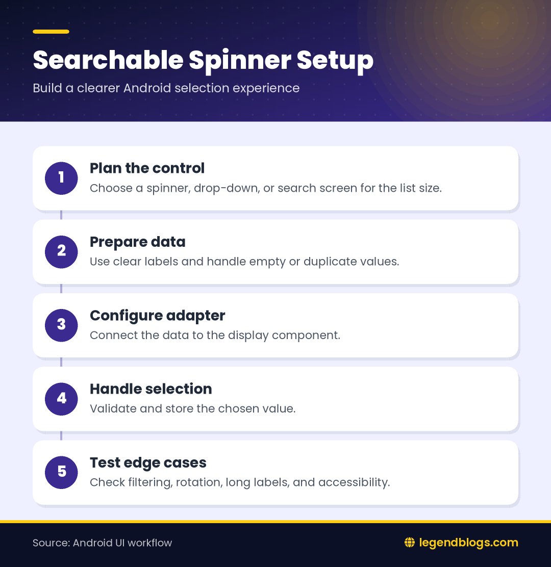
An Android searchable spinner is useful when a selection list contains more items than a user can comfortably scan. A normal spinner works well for a short list, but a search field can reduce scrolling when the list contains products, cities, categories, contacts, or other labels.
Choose the interaction deliberately
Before adding a library, decide whether the user needs a compact drop-down, a dialog with filtering, or a text field that suggests matching values. The best control depends on list size, whether values can be typed, and whether the selected value must come from the supplied data.
Review the Existing Library Approach
Why older examples need review
Many searchable spinner tutorials use an older third-party library and support libraries that may not match a current Android project. The original example is useful for understanding the idea, but you should check its maintenance, AndroidX compatibility, dependency source, and behavior on the devices you support.
Protect the project from avoidable failures
Use a test branch before adding a dependency to a production application. Confirm that Gradle can resolve it, check the package name in the documentation, and remove unused imports. If the library is no longer maintained, prefer a standard Android or Material component that your team can update.
Create the Android Project
Set the application basics
Create or open the Android project in Android Studio, choose Java if that is the language used by the existing application, and verify that the project builds before adding the spinner. A clean baseline makes dependency and layout errors easier to isolate.
Check AndroidX and namespaces
Older examples often import classes from the pre-AndroidX support packages. A modern project may require AndroidX imports instead. Do not mix both families in one screen without a clear migration plan; update imports according to the project configuration.
Add the Dependency Carefully
Read the library requirements
If you retain the original searchable-spinner dependency, add the exact coordinate recommended by its maintained documentation and sync Gradle. Do not guess a version or download a random archive. A dependency must be available from a repository configured for the project.
Check the build result
After syncing, build the application before writing more code. If Gradle reports that a package cannot be found, inspect repositories, spelling, version compatibility, and network access. If a class cannot be resolved, compare the import with the library’s actual package name.
Create the XML Layout
Give the control useful space
Place the searchable control in a layout that gives it enough width and a clear label. A selection field should not depend on placeholder text alone. Use a nearby label or a Material text-field pattern so users understand what they are selecting.
Consider accessibility
Provide a meaningful content description when appropriate, maintain readable contrast, and make the touch target comfortable. Test the control with a keyboard, screen reader, and a long selected value. A list that works only with short labels is not ready for real data.
Prepare the Java Activity
Initialize after the layout
Call setContentView before finding the spinner view. Keep view initialization in a predictable place, then create or load the data list. If the activity is recreated, make sure the selected value and list state are restored when the application requires it.
Keep data separate from display logic
For a small demonstration, an in-memory list is enough. In a real application, keep data loading, filtering, and display responsibilities separate. This makes it easier to replace sample values with a database, repository, or network response later.
Load Items Into the Spinner
Use clear values
Add values that are meaningful to the user rather than internal identifiers. If the application needs both an ID and a label, use a small model object or a mapped data structure and display only the label while retaining the identifier for submission.
Handle duplicates and empty lists
Remove accidental duplicate labels or make them distinguishable with additional context. Also define what happens when no data is available. The screen should show an empty state or a useful message instead of displaying a broken selector.
Configure the Adapter
Understand the adapter role
An adapter converts data into rows or choices that the control can display. Use the adapter expected by the selected library and provide a suitable layout for the collapsed value and the expanded results when the API supports both.
Filter without changing the source
Search should normally filter the displayed results rather than permanently deleting items from the source list. Keep the original collection available so clearing the search field restores all choices and reopening the control does not lose data.
Handle Selection Events
Read the selected value
Register the selection callback required by the control. In the callback, read the selected object or label, validate it if selection is optional, and update the screen or form model. Avoid performing a network request for every temporary highlight unless that behavior is intentional.
Separate selection from submission
A user may open a list, change a selection, and then cancel a form. Keep the selected value in the form state and submit it only after validation. This prevents accidental updates when the user is still browsing choices.
Improve Search and User Experience
Make matching predictable
Users usually expect search to ignore harmless differences such as letter case. Decide how spaces, punctuation, accents, and partial matches should behave. Explain an unmatched result clearly and provide a way to clear the query.
Think about large lists
Do not load a very large remote dataset into a simple spinner without considering memory, network delay, and response time. For large data, use a paged search screen or a text field connected to a repository. Show loading and error states instead of leaving the user guessing.
Troubleshoot Common Errors
Dependency and import errors
When the dependency fails, inspect the Gradle output first. Confirm the repository, artifact name, version, and compile configuration. When the layout inflates but the class is missing, check the fully qualified XML class name and rebuild after correcting imports.
Selection and display errors
If the selected value is blank, verify that the adapter returns the expected view and that the data list contains labels. If filtering returns unexpected rows, log the input and compare it with the normalized values used by the filter. Test empty, one-item, duplicate, and long-label cases.
Modern Alternatives
AutoCompleteTextView
An AutoCompleteTextView can be a better fit when users should type a value and receive suggestions. It provides a familiar text-entry pattern and can be paired with an adapter. Validate the final value if the form accepts only items from the suggestion list.
Material exposed dropdown menus
Material components provide a consistent visual pattern for exposed drop-down selection. They are useful for short and medium lists, although a separate searchable screen may still be clearer for a large dataset. Follow the component documentation for the project’s dependency version.
Choose based on the task
Use a normal spinner for a short fixed list, an exposed drop-down for a compact selection, and a searchable dialog or screen when users need filtering. The component should reflect the task instead of forcing every list into the same control.
Testing Checklist
Test normal and difficult data
- Open the list with no search text.
- Search using uppercase and lowercase letters.
- Clear the query and confirm that all values return.
- Test an empty result and a duplicate label.
- Select the first, middle, and last available item.
- Rotate the device or recreate the activity and inspect state.
- Test slow data loading, long labels, and accessibility services.
Check the complete form
Verify that the chosen value is still correct when the form is submitted, validation fails, or the user returns to the screen. Confirm that the stored identifier matches the visible label and that an optional selection can be cleared deliberately.
FAQ
How do I make a spinner searchable in Android?
You can use a maintained searchable-spinner component, an AutoCompleteTextView, or a Material exposed drop-down pattern. Choose the option that matches the size of the list and the project’s Android version.
Can I use a searchable spinner with Java?
Yes. The control can be initialized from a Java activity, supplied with an adapter, and connected to a selection listener. The exact imports and methods depend on the component or library you choose.
Why does the searchable spinner dependency fail?
Common causes include an unavailable artifact, an old support-library import, an incorrect version, a missing repository, or incompatibility with the project configuration. Read the Gradle error and verify the dependency documentation.
What is better than a searchable spinner?
For typed suggestions, AutoCompleteTextView may be clearer. For a large remote list, a dedicated search screen with loading and pagination can provide a better experience than loading every option into a spinner.
How do I get the selected spinner value?
Read the selected item in the component’s selection callback or from the adapter position, then map it to the application’s model. Validate the value before submitting the form.
Conclusion
An Android searchable spinner can make long selection lists easier to use, but the library is only one part of the solution. Plan the interaction, keep the data and display logic clear, handle empty and large lists, and test selection across the complete form.
For a new project, compare the older library approach with AndroidX-compatible and Material alternatives before committing to it. A simple, maintained component is usually easier to support than a dependency that only works in an old sample project.





Write a comment